A brand that loves to do grass

Who, Why and how
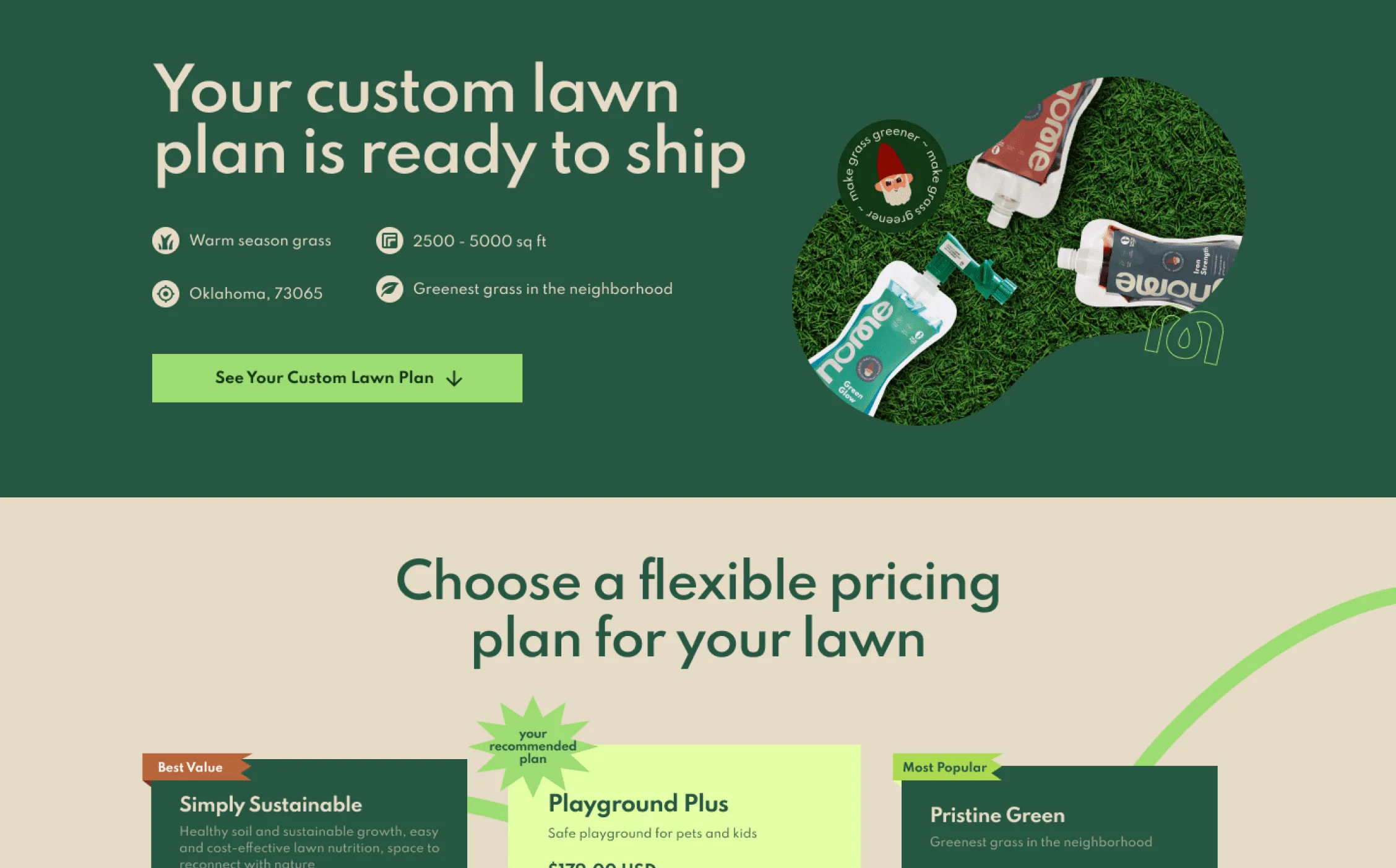
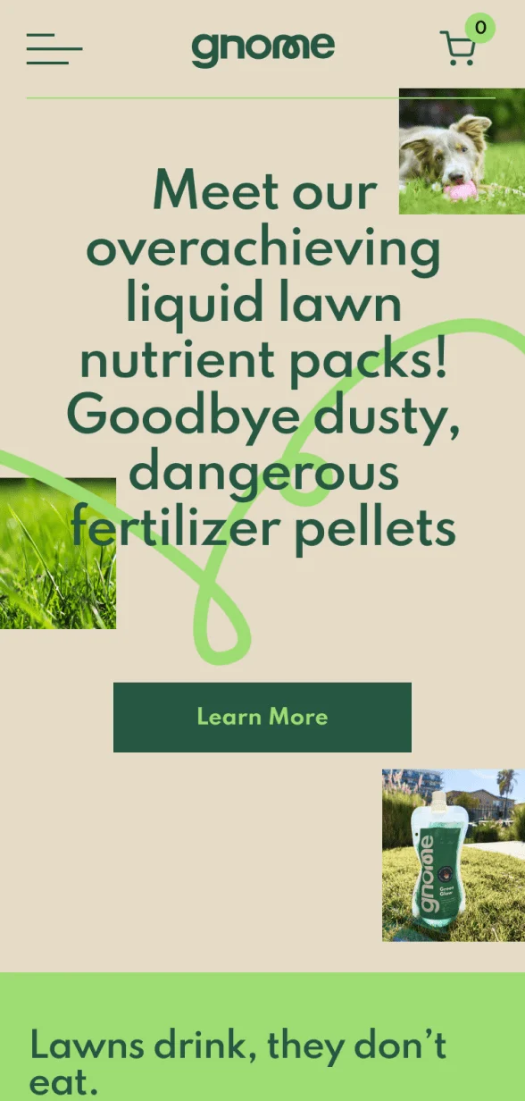
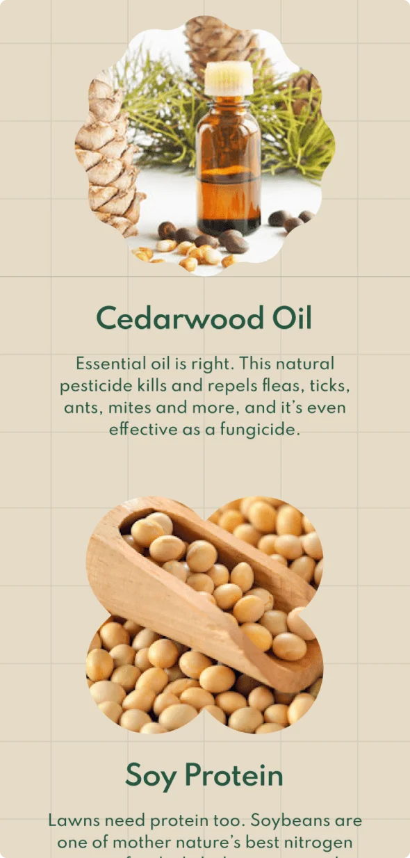
Gnome is a lawn-care brand, challenging the norms by providing custom solutions using natural ingredients that are better for people, pets and the planet. We worked closely with them to build the brand identity, website and packaging for their products which are environment friendly and incredibly easy to use.
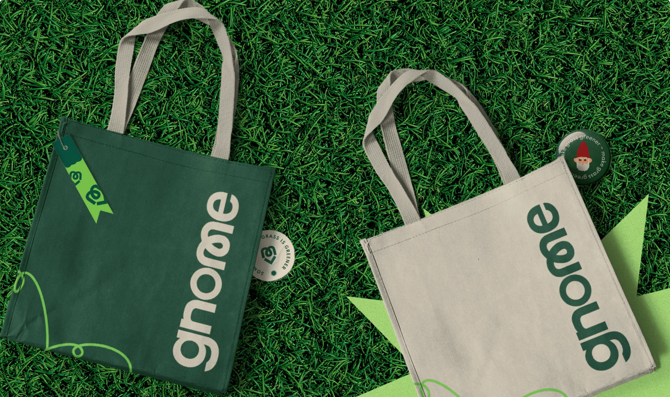
The Gnome logo is a custom crafted word-mark, inspired by a fun and lively sprig of grass. We encapsulated the caring and honest nature of the brand by pairing the expressive and stylised ‘m’ within a geometric font. We ensured that the identity was designed such that it could easily expand into various new products and services.


Bringing a bit of whimsy to the design system is the Gnome mascot. The visual framework has a fresh and cheerful colour palette, dominated by the greens that keep the natural essence of the brand intact. We approached the Gnome identity and packaging with the aim of creating a memorable brand that was fun, playful and honest. The prominent logotype stands as a consistent brand element across all packaging with colours that represent each product’s unique composition and purpose.
We extended Gnome’s quirky brand elements and personality to their e-commerce website to further articulate their mission to make lawn-care a fun and friendly experience across all screens.